Version 2025-07 is the last API version to support React-based UI components. Later versions use Polaris web components, native UI elements with built-in accessibility, better performance, and consistent styling with Shopify's design system. Check out the upgrade guide to upgrade your extension and avoid being blocked from updating your extension after October 1st 2026.
Map
The MapPopover component provides additional information or context about a specific location or point of interest on a map. Use MapPopover within a MapMarker to display details such as a store name, address, or hours of operation.
Supported targets
- Customer
Account::Kitchen Sink - customer-account.
footer. render-after - customer-account.
order-index. announcement. render - customer-account.
order-index. block. render - customer-account.
order-status. announcement. render - customer-account.
order-status. block. render - customer-account.
order-status. cart-line-item. render-after - customer-account.
order-status. cart-line-list. render-after - customer-account.
order-status. customer-information. render-after - customer-account.
order-status. fulfillment-details. render-after - customer-account.
order-status. payment-details. render-after - customer-account.
order-status. return-details. render-after - customer-account.
order-status. unfulfilled-items. render-after - customer-account.
order. action. menu-item. render - customer-account.
order. action. render - customer-account.
order. page. render - customer-account.
page. render - customer-account.
profile. addresses. render-after - customer-account.
profile. announcement. render - customer-account.
profile. block. render - customer-account.
profile. company-details. render-after - customer-account.
profile. company-location-addresses. render-after - customer-account.
profile. company-location-payment. render-after - customer-account.
profile. company-location-staff. render-after - customer-account.
profile. payment. render-after
Supported targets
- Customer
Account::Kitchen Sink - customer-account.
footer. render-after - customer-account.
order-index. announcement. render - customer-account.
order-index. block. render - customer-account.
order-status. announcement. render - customer-account.
order-status. block. render - customer-account.
order-status. cart-line-item. render-after - customer-account.
order-status. cart-line-list. render-after - customer-account.
order-status. customer-information. render-after - customer-account.
order-status. fulfillment-details. render-after - customer-account.
order-status. payment-details. render-after - customer-account.
order-status. return-details. render-after - customer-account.
order-status. unfulfilled-items. render-after - customer-account.
order. action. menu-item. render - customer-account.
order. action. render - customer-account.
order. page. render - customer-account.
page. render - customer-account.
profile. addresses. render-after - customer-account.
profile. announcement. render - customer-account.
profile. block. render - customer-account.
profile. company-details. render-after - customer-account.
profile. company-location-addresses. render-after - customer-account.
profile. company-location-payment. render-after - customer-account.
profile. company-location-staff. render-after - customer-account.
profile. payment. render-after
Anchor to PropertiesProperties
Configure the following properties on the MapPopover component.
- Anchor to idididstringstring
A unique identifier for the component. Use this to target the component in scripts or stylesheets, or to distinguish it from other instances of the same component.
- Anchor to onCloseon
Closeon Close () => void() => void A callback that fires when the popover is closed. Use this to clean up state or update the UI when the user dismisses the popover.
- Anchor to onOpenon
Openon Open () => void() => void A callback that fires when the popover is opened. Use this to load additional data or update the UI when the popover becomes visible.
Anchor to ExamplesExamples
Anchor to Add a map popoverAdd a map popover
Attach a popover to a map marker that displays when the marker is selected. This example shows a store name inside a popover connected to a MapMarker.
Add a map popover
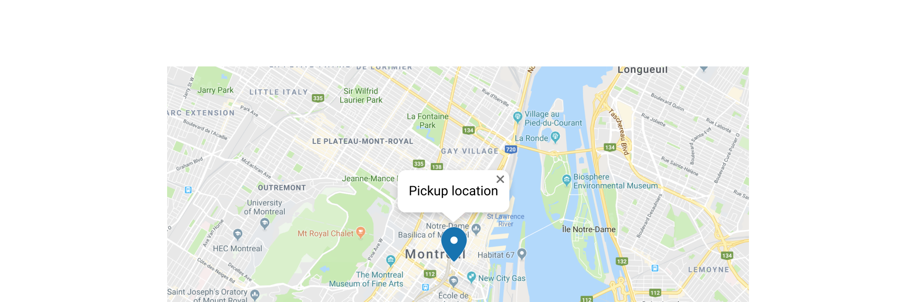
Add a map popover
React
import {
  reactExtension,
  Map,
  MapMarker,
  MapPopover,
} from '@shopify/ui-extensions-react/customer-account';

export default reactExtension(
  'customer-account.page.render',
  () => <Extension />,
);

function Extension() {
  return (
    <Map
      apiKey="YOUR_GOOGLE_MAPS_API_KEY"
      latitude={-28.024}
      longitude={140.887}
      zoom={4}
      accessibilityLabel="Map"
    >
      <MapMarker
        latitude={-28.024}
        longitude={140.887}
        accessibilityLabel="Map marker for Innamincka, Australia"
        overlay={
          <MapPopover>
            Blue Mountains National Park store
          </MapPopover>
        }
      />
    </Map>
  );
}
JS
import {
  extension,
  Map,
  MapMarker,
  MapPopover,
} from '@shopify/ui-extensions/customer-account';

export default extension('customer-account.page.render', (root) => {
  const popoverFragment = root.createFragment();
  const popover = root.createComponent(
    MapPopover,
    {},
    'Blue Mountains National Park store',
  );
  popoverFragment.appendChild(popover);
  const map = root.createComponent(
    Map,
    {
      apiKey: 'YOUR_API_KEY',
      accessibilityLabel: 'Map',
      latitude: -28.024,
      longitude: 140.887,
      zoom: 4,
    },
    [
      root.createComponent(MapMarker, {
        latitude: -28.024,
        longitude: 140.887,
        accessibilityLabel: 'Map marker for Innamincka, Australia',
        overlay: popoverFragment,
      }),
    ],
  );

  root.appendChild(map);
});
Anchor to Show store detailsShow store details
Display rich store information in a popover. This example renders the store name, address, and hours inside a BlockStack within the popover.
Show store details
React
import {
  reactExtension,
  Map,
  MapMarker,
  MapPopover,
  Text,
  BlockStack,
} from '@shopify/ui-extensions-react/customer-account';

export default reactExtension(
  'customer-account.page.render',
  () => <Extension />,
);

function Extension() {
  return (
    <Map
      apiKey="YOUR_GOOGLE_MAPS_API_KEY"
      latitude={40.7128}
      longitude={-74.006}
      zoom={15}
      accessibilityLabel="Map of Downtown Manhattan store"
    >
      <MapMarker
        latitude={40.7128}
        longitude={-74.006}
        accessibilityLabel="Downtown Manhattan store"
        overlay={
          <MapPopover>
            <BlockStack spacing="extraTight">
              <Text emphasis="bold">Downtown Manhattan</Text>
              <Text>123 Broadway, New York</Text>
              <Text appearance="subdued">Open until 9 PM</Text>
            </BlockStack>
          </MapPopover>
        }
      />
    </Map>
  );
}
JS
import {extension, Map, MapMarker, MapPopover, Text, BlockStack} from '@shopify/ui-extensions/customer-account';

export default extension('customer-account.page.render', (root) => {
  const name = root.createComponent(Text, {emphasis: 'bold'}, 'Downtown Manhattan');
  const address = root.createComponent(Text, {}, '123 Broadway, New York');
  const hours = root.createComponent(Text, {appearance: 'subdued'}, 'Open until 9 PM');
  const details = root.createComponent(BlockStack, {spacing: 'extraTight'});
  details.append(name);
  details.append(address);
  details.append(hours);

  const popover = root.createComponent(MapPopover);
  popover.append(details);

  const popoverFragment = root.createFragment();
  popoverFragment.append(popover);

  const marker = root.createComponent(MapMarker, {
    latitude: 40.7128,
    longitude: -74.006,
    accessibilityLabel: 'Downtown Manhattan store',
    overlay: popoverFragment,
  });

  const map = root.createComponent(Map, {
    apiKey: 'YOUR_GOOGLE_MAPS_API_KEY',
    latitude: 40.7128,
    longitude: -74.006,
    zoom: 15,
    accessibilityLabel: 'Map of Downtown Manhattan store',
  });
  map.append(marker);

  root.append(map);
});
Anchor to Best practicesBest practices
- Keep content brief and relevant: Display only essential details like the name, address, or a short description. Avoid overloading the popover with too much information.
- Maintain visual consistency: Ensure the popover style is consistent with the overall design of your extension.
- Include actionable information: When possible, include details that help customers take a next step, like directions or store hours.
Anchor to LimitationsLimitations
- Map popovers must be used as children of the MapMarker component. They can't be rendered independently.
- The popover's display area is limited. Long content might be truncated or cause overflow.