Layout
Layout design is the process of arranging visual elements such as text, images, and shapes on a page.
Apps have a variety of available layouts. These layouts adapt the app body content to every screen size and device type. Selecting the proper layout for the task at hand will benefit your app's merchant experience.
Anchor to Responsive grid layoutResponsive grid layout
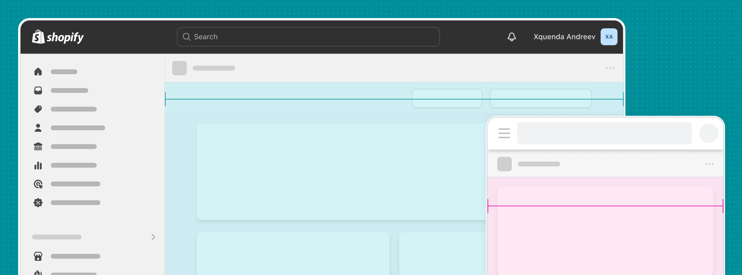
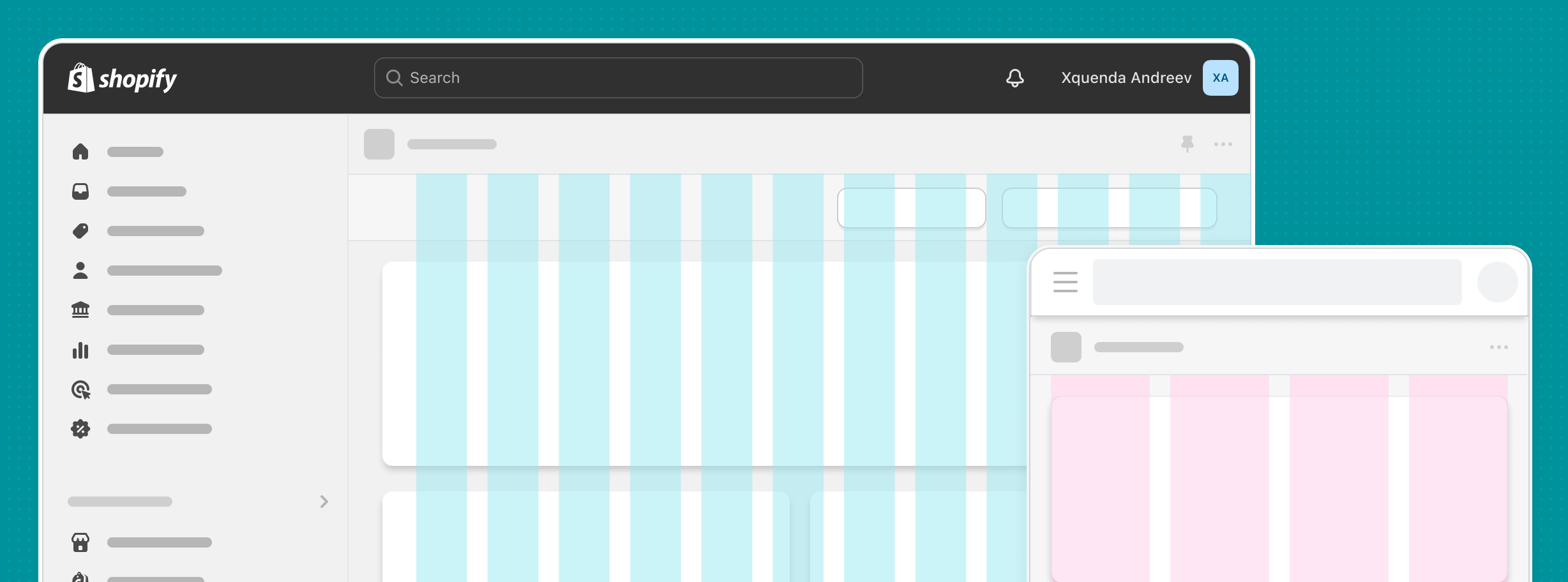
The page web component provides built-in responsiveness for the aside slot. The grid web component allows more bespoke responsive handling. Take these into consideration when you build your app.
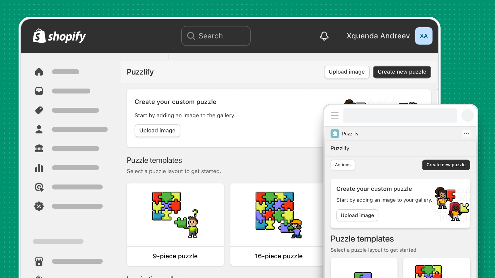
Design your app to be responsive and adapt to different screen sizes and devices. This ensures a consistent user experience across various platforms.
Anchor to Layout optionsLayout options
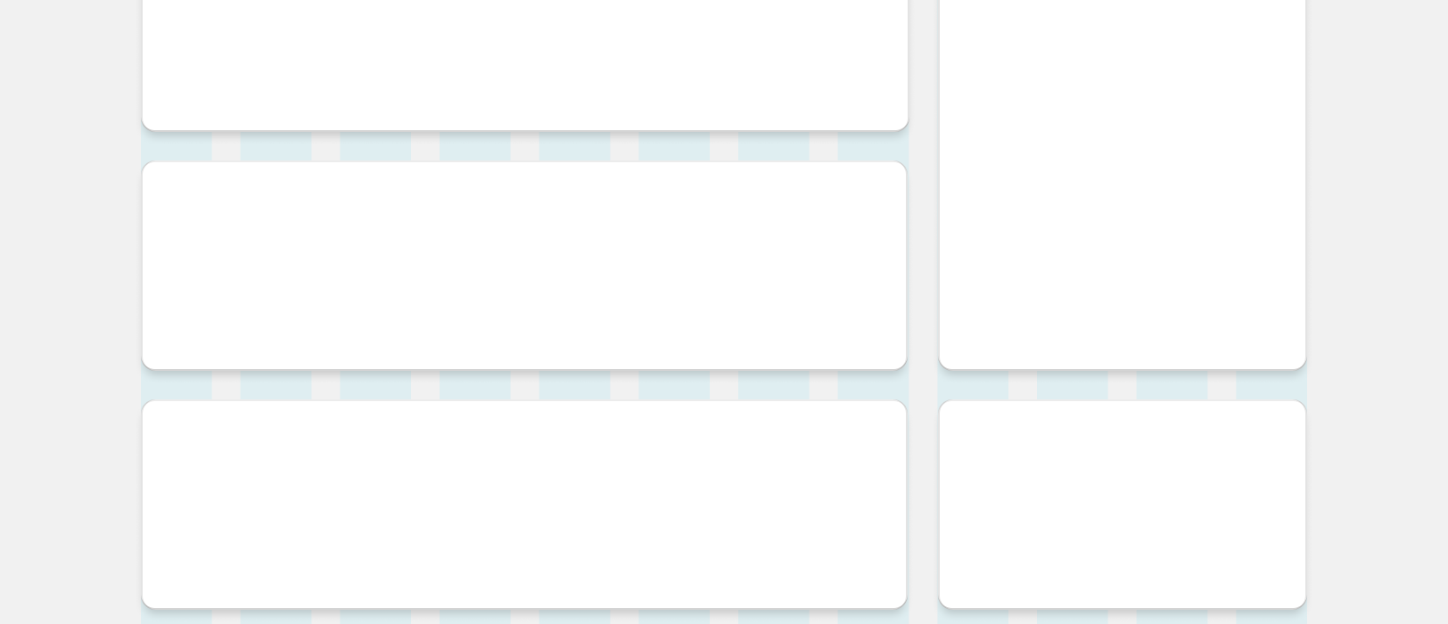
The page web component offers various layouts to match the complexity of your app.
Anchor to Single-column layoutSingle-column layout
The single-column layout enables merchants to scan content from top-to-bottom and focus on a single, obvious task.
Most often, an app's homepage uses the single-column layout in a default-width page. However, if your app feels more like a dashboard, then you can also use the two-column equal width or three-column layout.
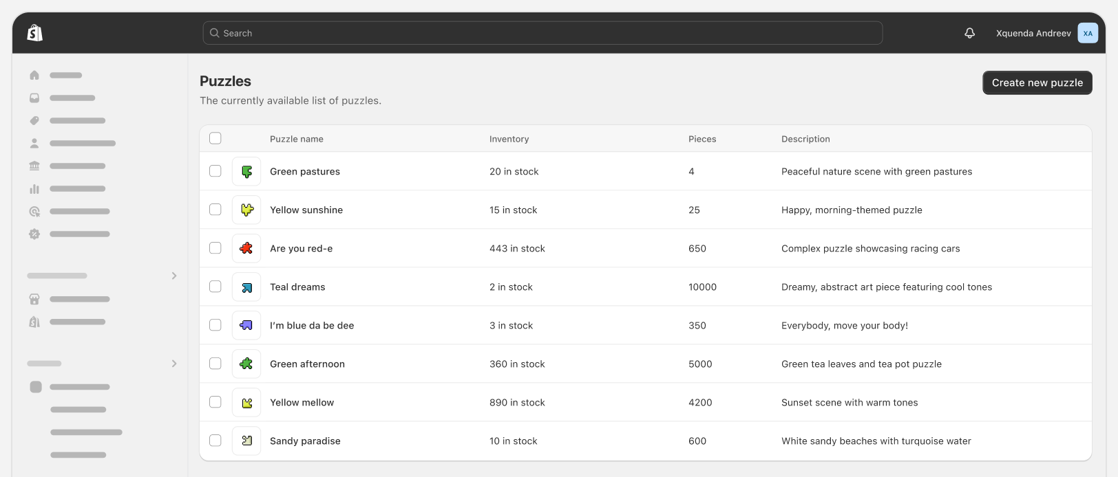
For resource index pages, use a full-width page. This is helpful when merchants are dealing with lists of data that have many columns.
Anchor to Two-column layoutTwo-column layout
Two-column layouts allow merchants to view more content at once. This is helpful for visual editors or content-dense pages.
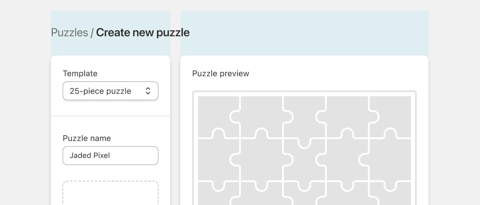
For visual editors, use a two-column layout. This allows merchants to preview the outcome of their edits in real-time.
Anchor to Settings layoutSettings layout
The settings layout lets merchants quickly scan and find groups of settings that are related to each other.
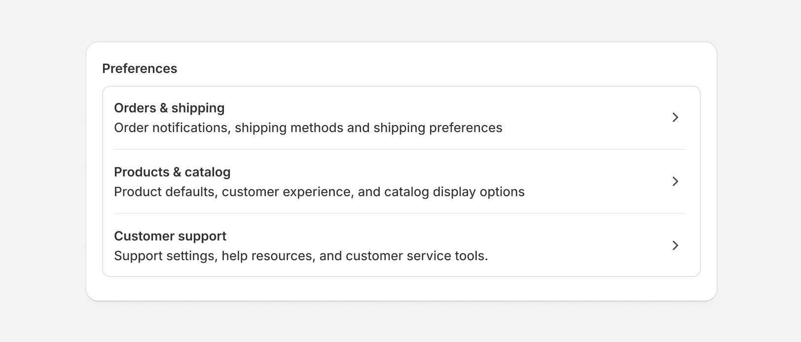
For settings pages, use the settings pattern to provide merchants with clear context about your app's configuration options.
Anchor to SpacingSpacing
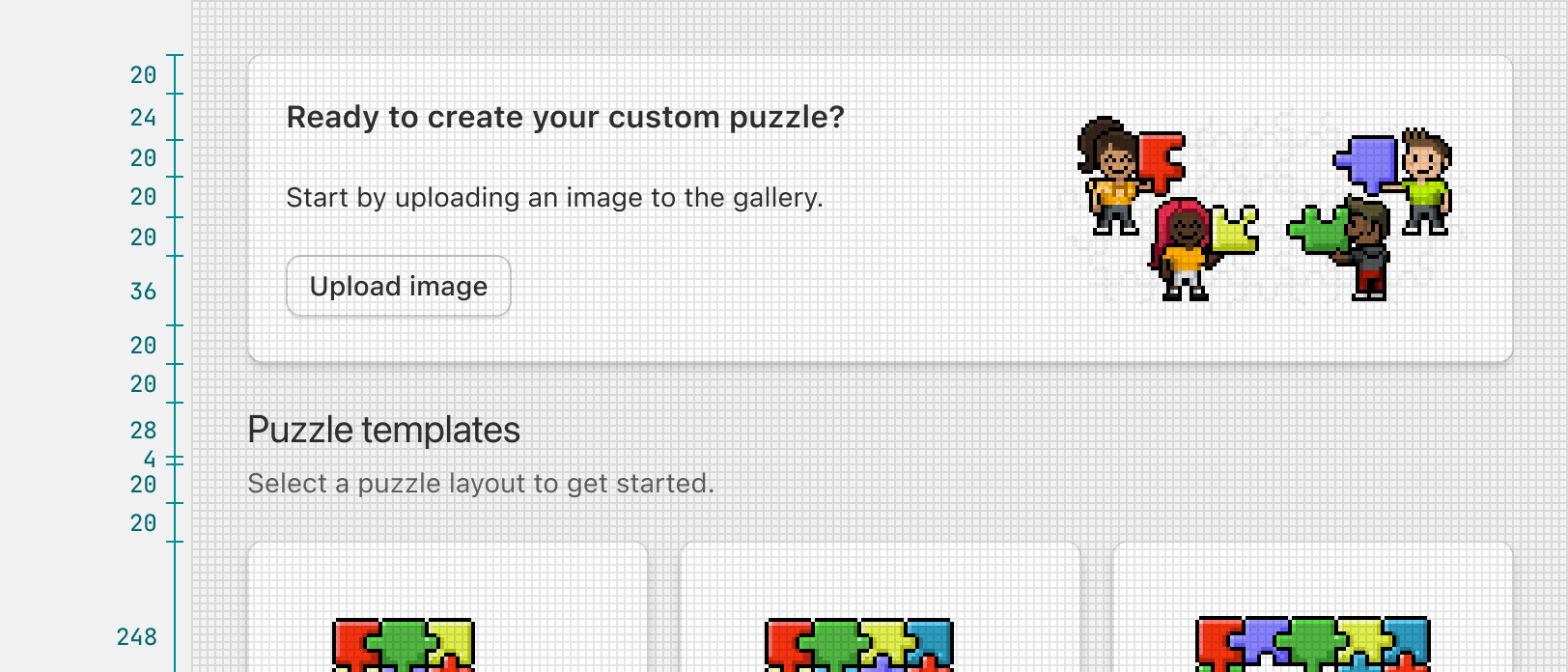
Spacing helps your app maintain a pleasant experience by keeping interface components well-positioned with consistent visual rhythm. To simplify spacing, use the stack web component.
Anchor to Information densityInformation density
The density of elements in a layout can greatly impact your app's readability and usability.
Make your app efficient and easy to use by providing the right density at the right moment, for the right task.
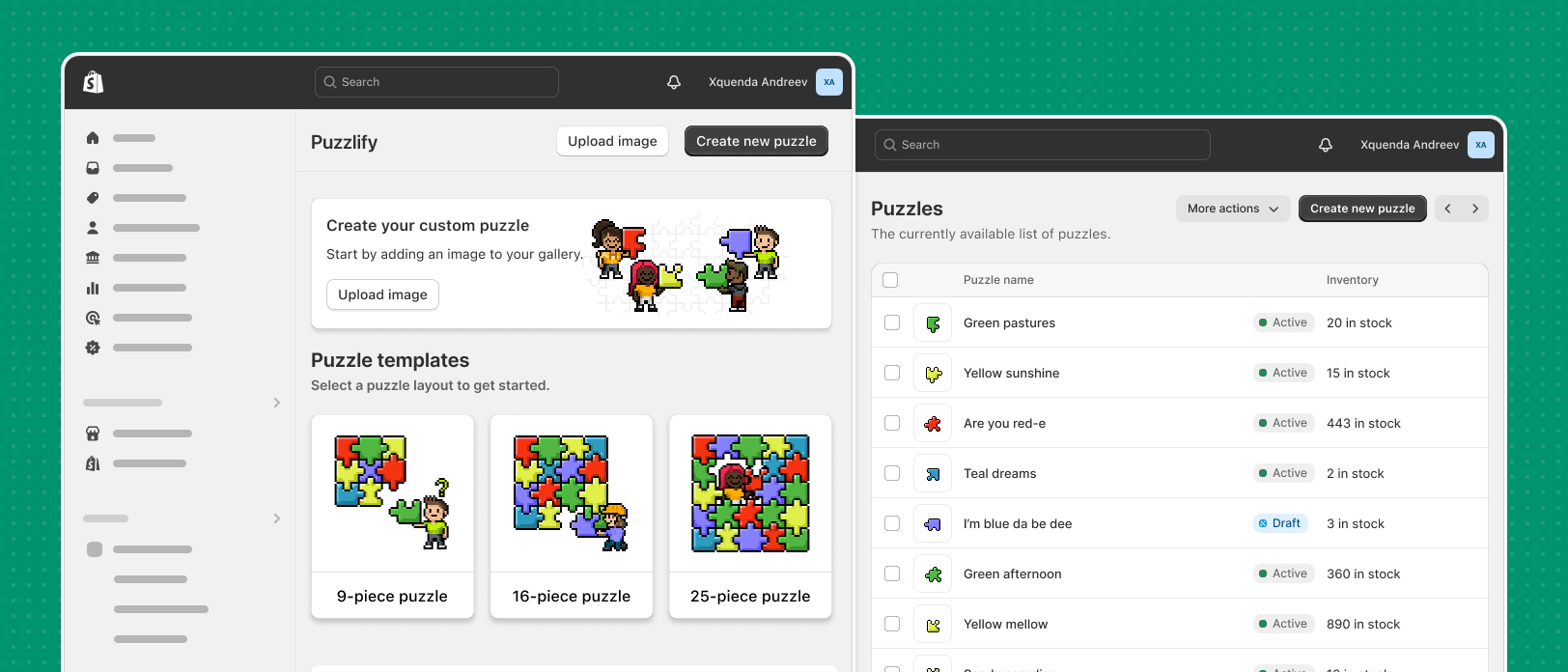
Use looser spacing for low-density layouts. Use tighter spacing for high-density layouts.
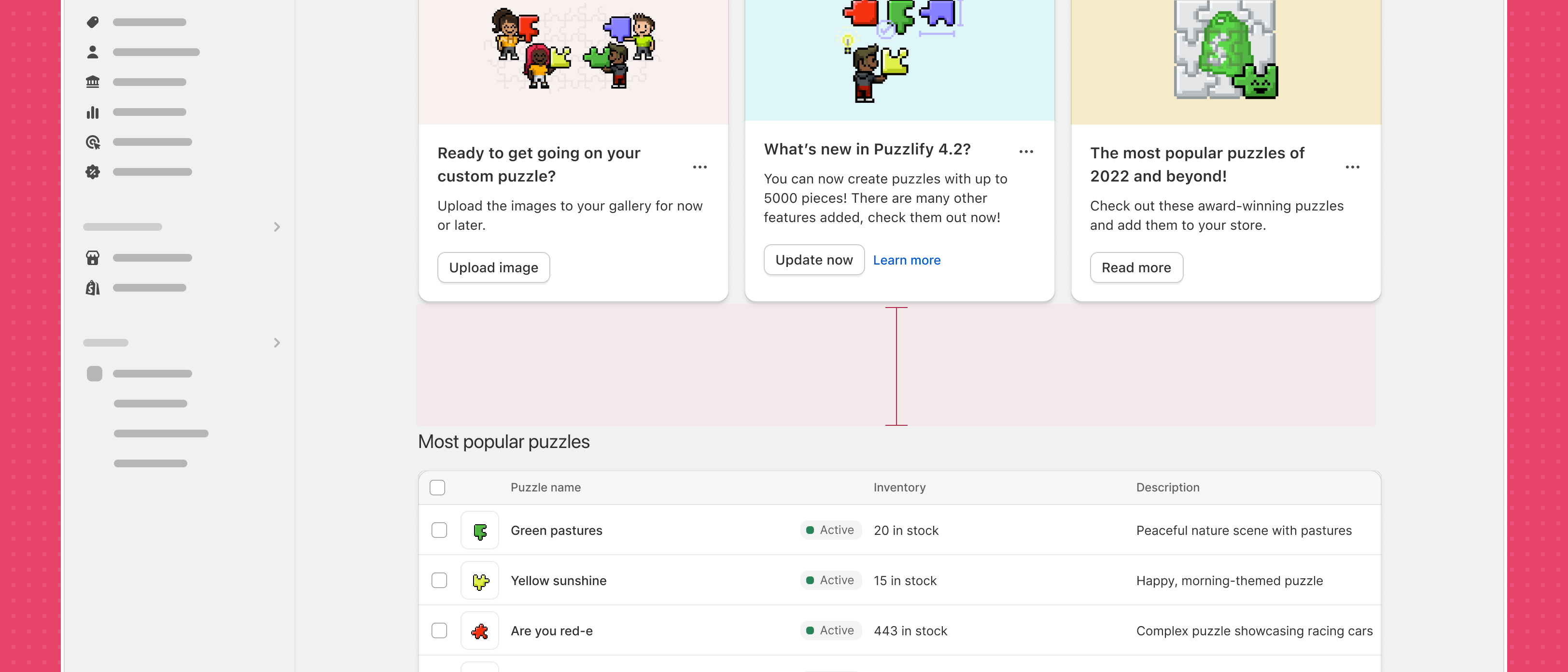
Avoid changing information density within a single page, otherwise your app can feel disjointed.
Anchor to ContainersContainers
Most of an app's content exists in containers. Containers compartmentalize content and create a natural hierarchy between parts of an interface.
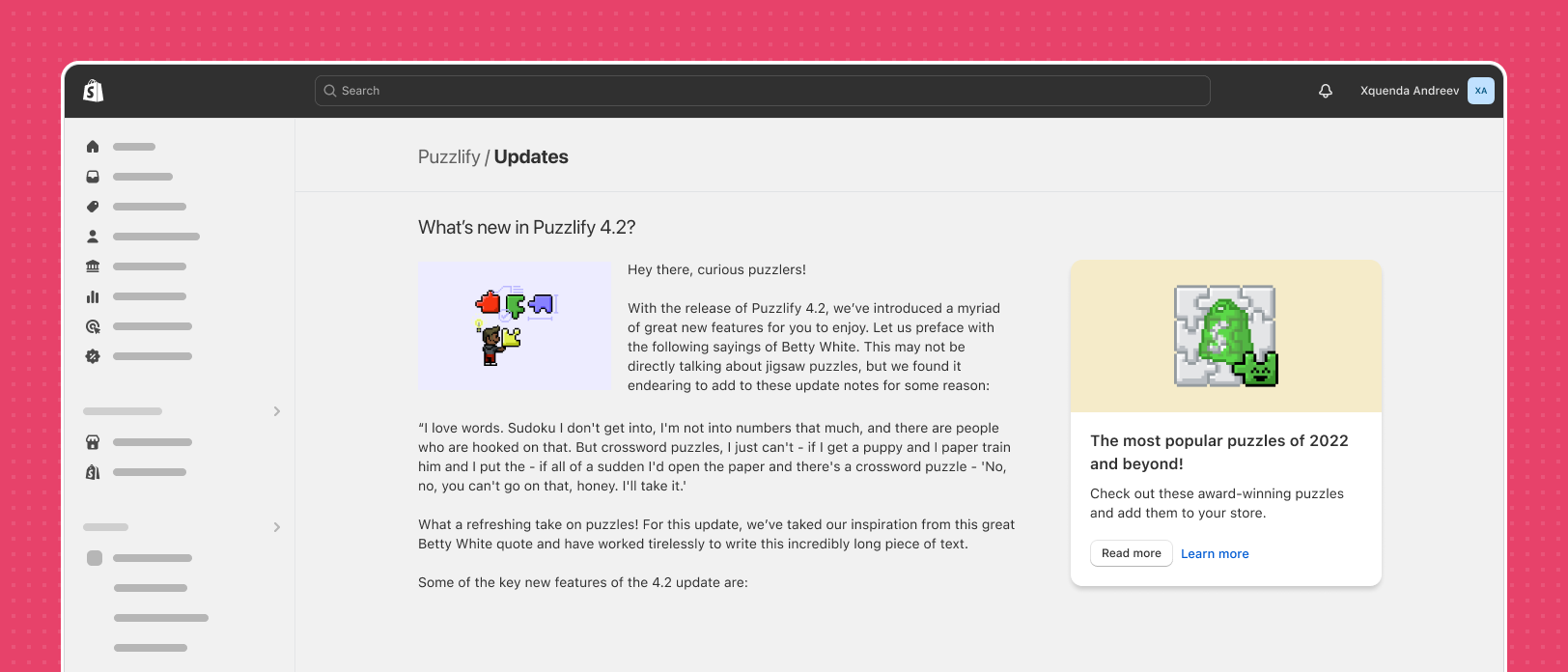
Avoid placing paragraphs of text directly on the background. This reduces legibility and makes scanning the page difficult for merchants.
Anchor to Using sectionsUsing sections
Sections structure your app's content so that merchants can scan information easily. Sections act as containers and can be static or interactive.
The section web component provides an easy way to segment content, while still respecting Shopify's App Design Guidelines.
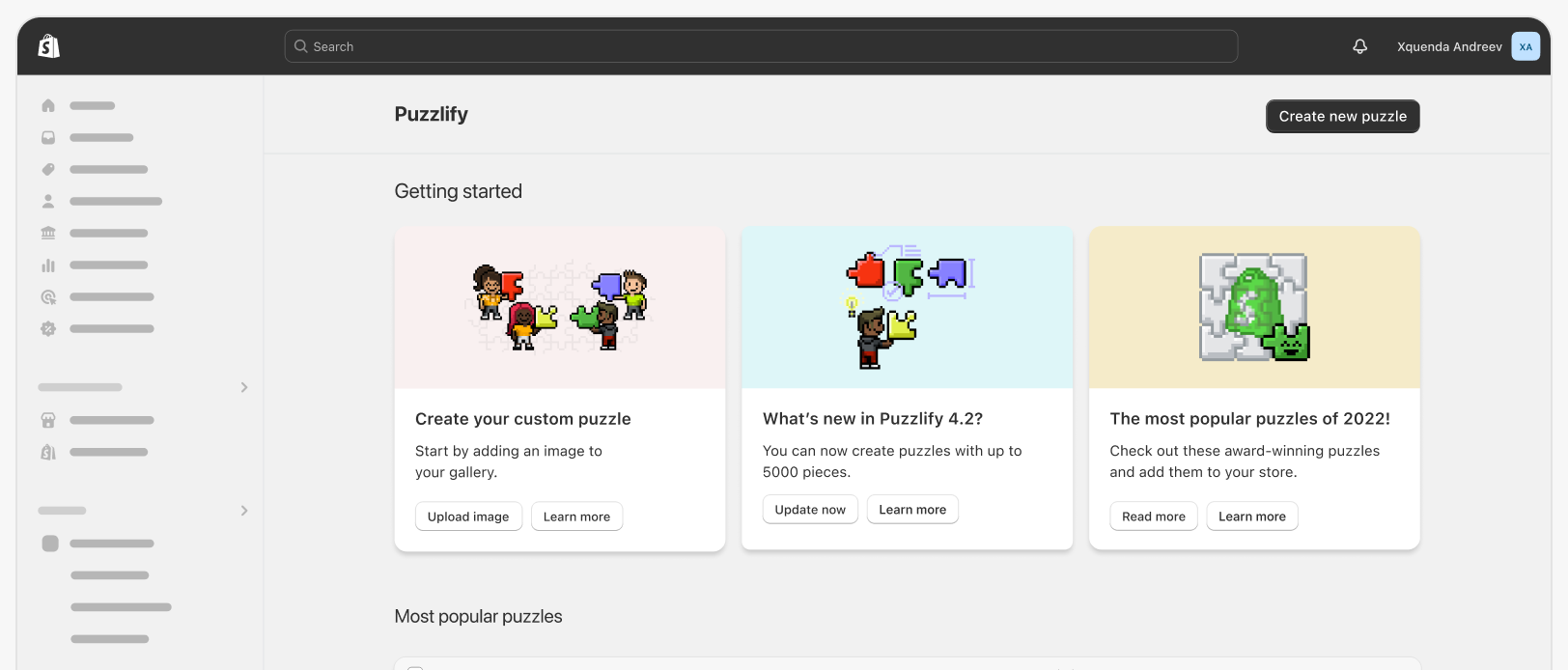
The majority of your app's content should live in a container, such as a card. This creates visual structure and rhythm that helps merchants find information quickly.
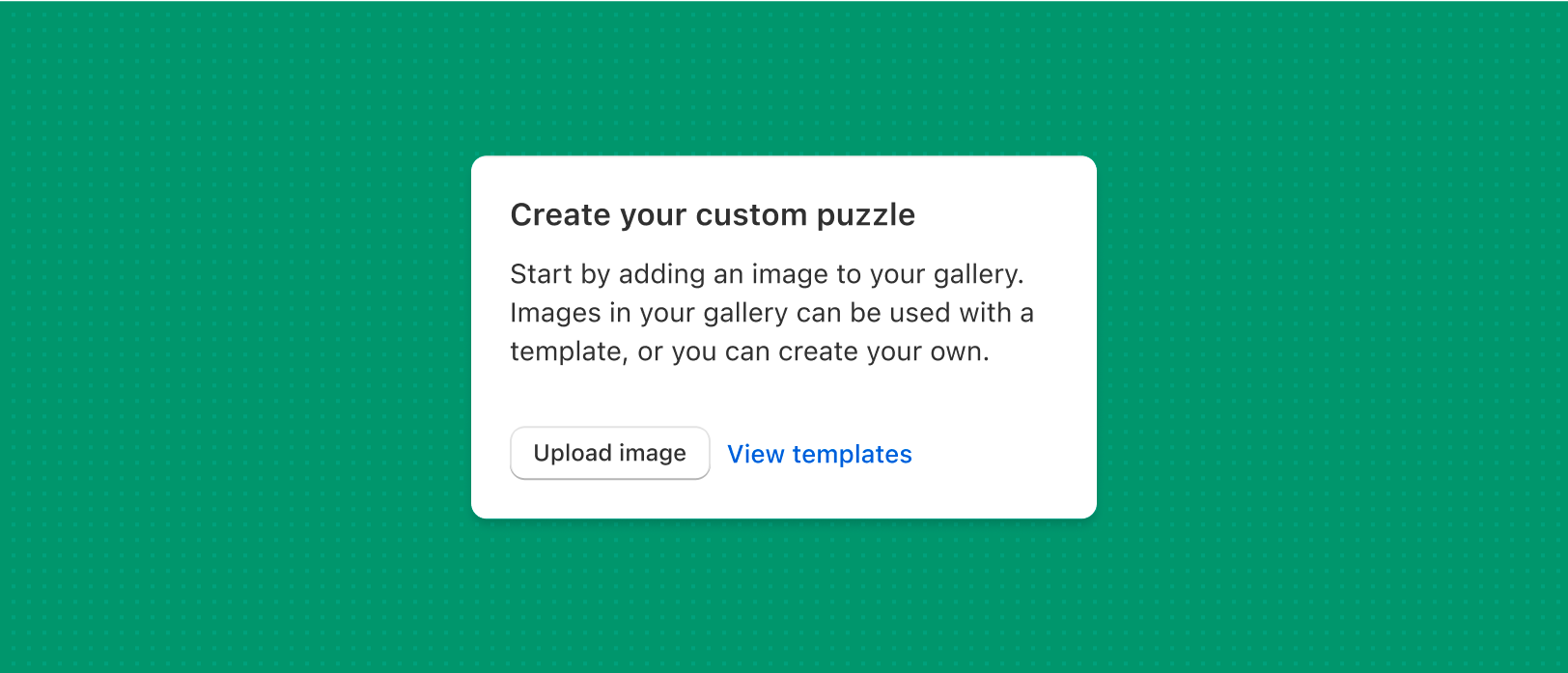
Cards that offer interactivity, such as calls to action (CTAs) and buttons, should have at most one primary styled action.
Anchor to Using tablesUsing tables
Tables are helpful for summarizing many object instances. Use the table web component for relatively simple summaries, and the Index table pattern when you have a lot of data to show.
Refer also to the Polaris pattern for Resource index layout, when you are summarizing resource objects.
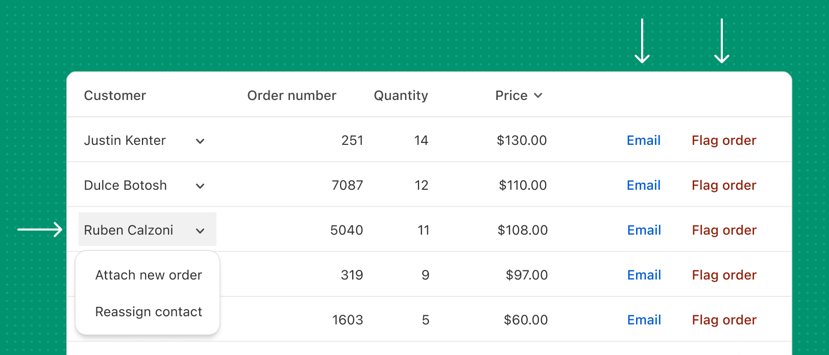
Actions in tables should use secondary action styling, such as a text button, minor icon, or dropdown menu. Avoid using primary style buttons in tables.