Version 2025-07 is the last API version to support React-based UI components. Later versions use Polaris web components, native UI elements with built-in accessibility, better performance, and consistent styling with Shopify's design system. Check out the upgrade guide to upgrade your extension and avoid being blocked from updating your extension after October 1st 2026.
Map
The Map component displays an interactive map on a page. Use Map to show geographic locations such as store addresses, pickup points, or customer delivery destinations.
Maps render using Google Maps and require an API key along with a set of allowed domains. You can add markers to highlight specific locations and attach popovers to provide additional details about each point.
The 3 necessary domains needed are:
-
https://*.[MERCHANT-DOMAIN].com -
https://shop.app -
https://shopify.com
Where * is a wildcard. Learn more about match patterns.
Refer to the Google Maps Platform documentation for details on how to get an API key.
Supported targets
- Customer
Account::Kitchen Sink - customer-account.
footer. render-after - customer-account.
order-index. announcement. render - customer-account.
order-index. block. render - customer-account.
order-status. announcement. render - customer-account.
order-status. block. render - customer-account.
order-status. cart-line-item. render-after - customer-account.
order-status. cart-line-list. render-after - customer-account.
order-status. customer-information. render-after - customer-account.
order-status. fulfillment-details. render-after - customer-account.
order-status. payment-details. render-after - customer-account.
order-status. return-details. render-after - customer-account.
order-status. unfulfilled-items. render-after - customer-account.
order. action. menu-item. render - customer-account.
order. action. render - customer-account.
order. page. render - customer-account.
page. render - customer-account.
profile. addresses. render-after - customer-account.
profile. announcement. render - customer-account.
profile. block. render - customer-account.
profile. company-details. render-after - customer-account.
profile. company-location-addresses. render-after - customer-account.
profile. company-location-payment. render-after - customer-account.
profile. company-location-staff. render-after - customer-account.
profile. payment. render-after
Supported targets
- Customer
Account::Kitchen Sink - customer-account.
footer. render-after - customer-account.
order-index. announcement. render - customer-account.
order-index. block. render - customer-account.
order-status. announcement. render - customer-account.
order-status. block. render - customer-account.
order-status. cart-line-item. render-after - customer-account.
order-status. cart-line-list. render-after - customer-account.
order-status. customer-information. render-after - customer-account.
order-status. fulfillment-details. render-after - customer-account.
order-status. payment-details. render-after - customer-account.
order-status. return-details. render-after - customer-account.
order-status. unfulfilled-items. render-after - customer-account.
order. action. menu-item. render - customer-account.
order. action. render - customer-account.
order. page. render - customer-account.
page. render - customer-account.
profile. addresses. render-after - customer-account.
profile. announcement. render - customer-account.
profile. block. render - customer-account.
profile. company-details. render-after - customer-account.
profile. company-location-addresses. render-after - customer-account.
profile. company-location-payment. render-after - customer-account.
profile. company-location-staff. render-after - customer-account.
profile. payment. render-after
Anchor to PropertiesProperties
Configure the following properties on the Map component.
- Anchor to accessibilityLabelaccessibility
Labelaccessibility Label stringstringrequiredrequired A label that describes the purpose or contents of the map. It will be announced to users using assistive technologies and will provide them with more context.
- Anchor to apiKeyapi
Keyapi Key stringstringrequiredrequired The Google Maps API key used to authenticate requests. You can obtain a key from the Google Maps Platform.
- Anchor to latitudelatitudelatitudenumbernumberrequiredrequired
The latitude of the center of the map, in degrees. Valid values range from -90 (south pole) to 90 (north pole).
- Anchor to longitudelongitudelongitudenumbernumberrequiredrequired
The longitude of the center of the map, in degrees. Valid values range from -180 (west) to 180 (east).
- Anchor to idididstringstring
A unique identifier for the map. Used to set a unique map ID for the Google Maps API. If omitted, the map component automatically generates a unique identifier. If you provide one, you must ensure it is unique across all maps in the extension.
- Anchor to maxBlockSizemax
Block Sizemax Block Size MaybeResponsiveConditionalStyle< number | `${number}%` | 'fill' >MaybeResponsiveConditionalStyle< number | `${number}%` | 'fill' > The maximum block size (maximum height in horizontal writing modes). The element won't grow taller than this value even if its content is longer.
number: The size in pixels.`${number}%`: The size as a percentage of the parent container's block size.'fill': Takes all the available space.
Learn more about the max-block-size property.
- Anchor to maxInlineSizemax
Inline Sizemax Inline Size MaybeResponsiveConditionalStyle< number | `${number}%` | 'fill' >MaybeResponsiveConditionalStyle< number | `${number}%` | 'fill' > The maximum inline size (maximum width in horizontal writing modes). The element won't grow wider than this value.
number: The size in pixels.`${number}%`: The size as a percentage of the parent container's inline size.'fill': Takes all the available space.
Learn more about the max-inline-size property.
- Anchor to maxZoommax
Zoommax Zoom numbernumber The maximum zoom level the user can zoom in to. Prevents the map from being zoomed in beyond this level.
- Anchor to minBlockSizemin
Block Sizemin Block Size MaybeResponsiveConditionalStyle< number | `${number}%` | 'fill' >MaybeResponsiveConditionalStyle< number | `${number}%` | 'fill' > The minimum block size (minimum height in horizontal writing modes). The element won't shrink smaller than this value even if its content is shorter.
number: The size in pixels.`${number}%`: The size as a percentage of the parent container's block size.'fill': Takes all the available space.
Learn more about the min-block-size property.
- Anchor to minInlineSizemin
Inline Sizemin Inline Size MaybeResponsiveConditionalStyle< number | `${number}%` | 'fill' >MaybeResponsiveConditionalStyle< number | `${number}%` | 'fill' > The minimum inline size (minimum width in horizontal writing modes). The element won't shrink narrower than this value.
number: The size in pixels.`${number}%`: The size as a percentage of the parent container's inline size.'fill': Takes all the available space.
Learn more about the min-inline-size property.
- Anchor to minZoommin
Zoommin Zoom numbernumber The minimum zoom level the user can zoom out to. Prevents the map from being zoomed out beyond this level.
- Anchor to onBoundsChangeon
Bounds Changeon Bounds Change (bounds: MapBounds) => void(bounds: MapBounds) => void A callback that fires when the visible area of the map changes (for example, after the user pans the map). Receives the new bounding box as a
object withandcorners.- Anchor to onCenterChangeon
Center Changeon Center Change (location: MapLocation) => void(location: MapLocation) => void A callback that fires when the center point of the map changes (for example, after the user pans the map). Receives the new center as a
coordinate pair.- Anchor to onDoublePresson
Double Presson Double Press (location: MapLocation) => void(location: MapLocation) => void A callback that fires when the user double-presses (double-clicks) the map. Receives the geographic
coordinate pair of the double-press point.- Anchor to onPresson
Presson Press (location: MapLocation) => void(location: MapLocation) => void A callback that fires when the user presses (clicks or taps) the map. Receives the geographic
coordinate pair of the press point.- Anchor to onZoomChangeon
Zoom Changeon Zoom Change (zoom: MapZoom) => void(zoom: MapZoom) => void A callback that fires when the map's zoom level changes (for example, after the user pinches to zoom or uses the zoom controls). Receives the new zoom level as a
value (1–18).- Anchor to zoomzoomzoomnumbernumber
The initial zoom level of the map. Must be an integer between 0 and 18, where lower values show a wider area and higher values show more detail.
MaybeResponsiveConditionalStyle
A type that represents a value that can be a conditional style. The conditions are based on the viewport size. We highly recommend using the `Style` helper which simplifies the creation of conditional styles.
T | ConditionalStyle<T, ViewportSizeCondition>ConditionalStyle
A conditional style definition that maps one or more conditions to different values. The `default` value is used as a fallback when none of the conditions in `conditionals` are satisfied.
- conditionals
An array of conditional values.
ConditionalValue<T, AcceptedConditions>[] - default
The default value applied when none of the conditional values specified in `conditionals` are met.
T
ConditionalValue
A single conditional branch that pairs a set of conditions with the value to apply when those conditions are met.
- conditions
The conditions that must be met for the value to be applied. At least one condition must be specified.
AcceptedConditions - value
The value that will be applied if the conditions are met.
T
ViewportSizeCondition
A condition that targets layouts based on the inline size (width in horizontal writing modes) of the viewport.
- viewportInlineSize
The minimum viewport inline size that the condition must match.
{ min: T; }
MapBounds
A geographic bounding box defined by its north-east and south-west corners. Used to describe the visible area of the map.
- northEast
The north-east (top-right) corner of the bounding box.
MapLocation - southWest
The south-west (bottom-left) corner of the bounding box.
MapLocation
MapLocation
A geographic coordinate pair representing a point on the map.
- latitude
The latitude of the location, in degrees. Valid values range from -90 (south pole) to 90 (north pole).
number - longitude
The longitude of the location, in degrees. Valid values range from -180 (west) to 180 (east).
number
MapZoom
The zoom level of the map, as an integer between 1 and 18. Lower values show a wider area (such as a whole country), while higher values show a more detailed view (such as a street block).
1 | 2 | 3 | 4 | 5 | 6 | 7 | 8 | 9 | 10 | 11 | 12 | 13 | 14 | 15 | 16 | 17 | 18Anchor to ExamplesExamples
Anchor to Display a locationDisplay a location
Show a single location on a map centered at specific coordinates. This example creates a basic map with a zoom level that provides regional context.
Display a location
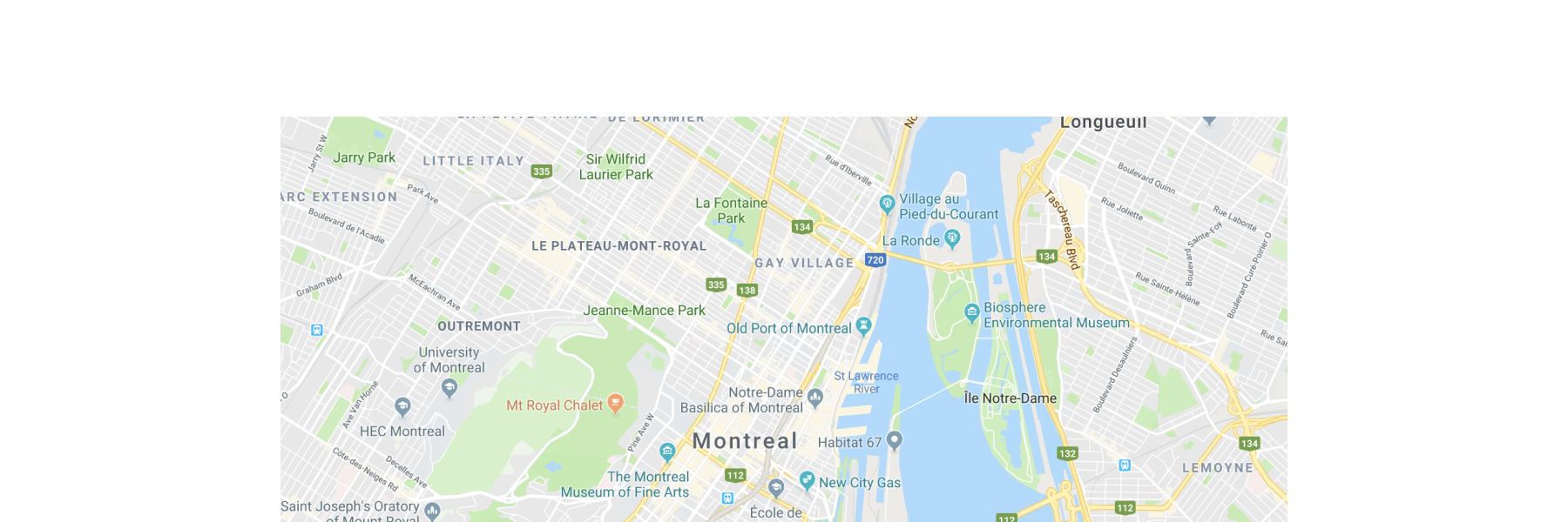
Display a location
React
import {
  reactExtension,
  Map,
} from '@shopify/ui-extensions-react/customer-account';

export default reactExtension(
  'customer-account.page.render',
  () => <Extension />,
);

function Extension() {
  return (
    <Map
      apiKey="YOUR_GOOGLE_MAPS_API_KEY"
      latitude={-28.024}
      longitude={140.887}
      zoom={4}
      accessibilityLabel="Map showing pickup locations"
    />
  );
}
JS
import {extension, Map} from '@shopify/ui-extensions/customer-account';

export default extension('customer-account.page.render', (root) => {
  const map = root.createComponent(Map, {
    apiKey: 'YOUR_API_KEY',
    accessibilityLabel: 'Map showing pickup locations',
    latitude: -28.024,
    longitude: 140.887,
    zoom: 4,
  });

  root.appendChild(map);
});
Anchor to Add multiple markersAdd multiple markers
Display several locations on a single map. This example places three markers at different coordinates using MapMarker with MapPopover children that display store names when selected.
Add multiple markers
React
import {
  reactExtension,
  Map,
  MapMarker,
  MapPopover,
} from '@shopify/ui-extensions-react/customer-account';

export default reactExtension(
  'customer-account.page.render',
  () => <Extension />,
);

function Extension() {
  return (
    <Map
      apiKey="YOUR_GOOGLE_MAPS_API_KEY"
      latitude={40.73}
      longitude={-73.99}
      zoom={11}
      accessibilityLabel="Map of New York City with three store locations"
    >
      <MapMarker
        latitude={40.7128}
        longitude={-74.006}
        accessibilityLabel="Downtown Manhattan store"
        overlay={
          <MapPopover>Downtown Manhattan</MapPopover>
        }
      />
      <MapMarker
        latitude={40.7549}
        longitude={-73.984}
        accessibilityLabel="Midtown Manhattan store"
        overlay={
          <MapPopover>Midtown Manhattan</MapPopover>
        }
      />
      <MapMarker
        latitude={40.7282}
        longitude={-73.7949}
        accessibilityLabel="Queens store"
        overlay={
          <MapPopover>Queens</MapPopover>
        }
      />
    </Map>
  );
}
JS
import {extension, Map, MapMarker, MapPopover} from '@shopify/ui-extensions/customer-account';

export default extension('customer-account.page.render', (root) => {
  const locations = [
    {lat: 40.7128, lng: -74.006, label: 'Downtown Manhattan'},
    {lat: 40.7549, lng: -73.984, label: 'Midtown Manhattan'},
    {lat: 40.7282, lng: -73.7949, label: 'Queens'},
  ];

  const map = root.createComponent(Map, {
    apiKey: 'YOUR_GOOGLE_MAPS_API_KEY',
    latitude: 40.73,
    longitude: -73.99,
    zoom: 11,
    accessibilityLabel: 'Map of New York City with three store locations',
  });

  locations.forEach(({lat, lng, label}) => {
    const popover = root.createComponent(MapPopover, {}, label);
    const marker = root.createComponent(MapMarker, {
      latitude: lat,
      longitude: lng,
      accessibilityLabel: `${label} store`,
      overlay: popover,
    });
    map.append(marker);
  });

  root.append(map);
});
Anchor to Show a pickup locationShow a pickup location
Present a pickup point within a Section with a text address. This example combines a map with supporting text so customers can identify the location visually and by address.
Show a pickup location
React
import {
  reactExtension,
  Map,
  MapMarker,
  MapPopover,
  Text,
  Heading,
  BlockStack,
  Section,
} from '@shopify/ui-extensions-react/customer-account';

export default reactExtension(
  'customer-account.page.render',
  () => <Extension />,
);

function Extension() {
  return (
    <Section>
      <Heading>Pickup location</Heading>
      <BlockStack spacing="base">
        <Map
          apiKey="YOUR_GOOGLE_MAPS_API_KEY"
          latitude={40.7128}
          longitude={-74.006}
          zoom={15}
          accessibilityLabel="Map showing pickup location in Downtown Manhattan"
        >
          <MapMarker
            latitude={40.7128}
            longitude={-74.006}
            accessibilityLabel="Pickup point"
            overlay={
              <MapPopover>Downtown Manhattan Store</MapPopover>
            }
          />
        </Map>
        <Text emphasis="bold">Downtown Manhattan Store</Text>
        <Text appearance="subdued">123 Broadway, New York, NY 10006</Text>
      </BlockStack>
    </Section>
  );
}
JS
import {extension, Map, MapMarker, MapPopover, Text, Heading, BlockStack, Section} from '@shopify/ui-extensions/customer-account';

export default extension('customer-account.page.render', (root) => {
  const popover = root.createComponent(MapPopover, {}, 'Downtown Manhattan Store');
  const popoverFragment = root.createFragment();
  popoverFragment.append(popover);

  const marker = root.createComponent(MapMarker, {
    latitude: 40.7128,
    longitude: -74.006,
    accessibilityLabel: 'Pickup point',
    overlay: popoverFragment,
  });

  const map = root.createComponent(Map, {
    apiKey: 'YOUR_GOOGLE_MAPS_API_KEY',
    latitude: 40.7128,
    longitude: -74.006,
    zoom: 15,
    accessibilityLabel: 'Map showing pickup location in Downtown Manhattan',
  });
  map.append(marker);

  const storeName = root.createComponent(Text, {emphasis: 'bold'}, 'Downtown Manhattan Store');
  const address = root.createComponent(Text, {appearance: 'subdued'}, '123 Broadway, New York, NY 10006');
  const heading = root.createComponent(Heading, {}, 'Pickup location');

  const stack = root.createComponent(BlockStack, {spacing: 'base'});
  stack.append(map);
  stack.append(storeName);
  stack.append(address);

  const section = root.createComponent(Section);
  section.append(heading);
  section.append(stack);

  root.append(section);
});
Anchor to Best practicesBest practices
- Provide a sensible default view: Set the initial map center and zoom level so that all relevant markers are visible without requiring the customer to pan or zoom.
- Use distinct marker icons for different states: If your markers are interactive, make sure the selected marker's icon is visually different from non-selected markers so customers can identify their selection.
- Cluster markers when displaying many locations: If there are a large number of markers obscuring important features of the map, set the markers to
clusterableto help increase readability. - Include supporting context: Pair the map with text-based address information so customers who can't interact with the map still have access to the location details.
Anchor to LimitationsLimitations
- The map requires a Google Maps API key and a set of allowed domains where the map renders. Refer to the Google Maps Platform documentation for details on obtaining an API key.
- Map rendering depends on the customer's network connection and Google Maps availability. The component doesn't provide a built-in fallback for offline scenarios.